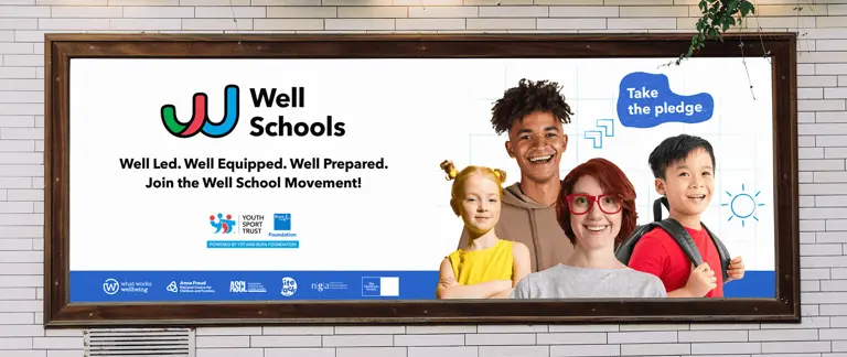
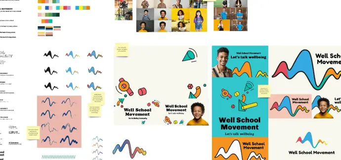
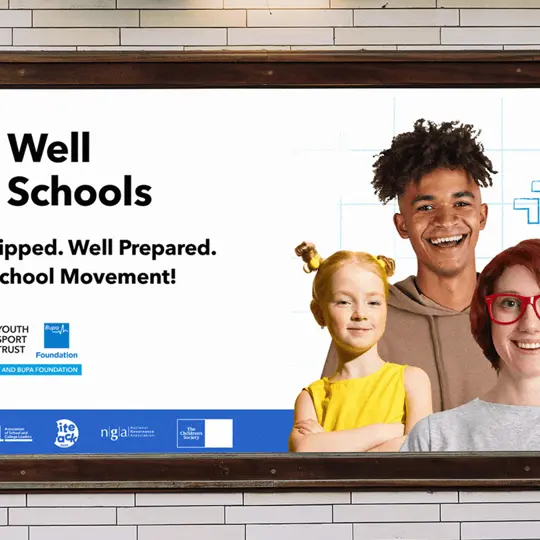
A key consideration of the project was ensuring that the Well Schools identity sits comfortably alongside its parent brand. For this reason, we adopted the YST fonts. Avenir Next allows Well Schools and Youth Sport Trust to share a voice. A bright, vibrant colour palette was chosen, inspired by the YST core colours but exaggerating their tone. Together, these elements made for a natural evolution from a brand recognition perspective.
Confident and positive photography was chosen to represent the spirit of Well Schools and reinforce the brand's message. Models engage with the viewer through direct eye contact. From young boys to senior female leaders, we chose photography that resonates with all 3 audience groups.
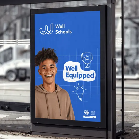
Well Schools are built upon 3 pillars; Well Led, Well Prepared, Well Equipped. Iconography has been developed to represent each one, all with strong ties to education. A Grid texture was also introduced; a nod to students’ workbooks, and to a connected network of people, peers, and schools. Key messages were housed in playful speech bubbles.
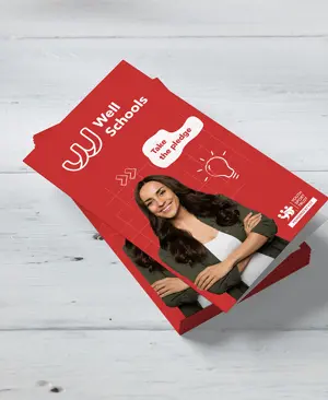
We delivered a brand toolkit and a clear guidelines document, empowering the YST in-house design team to create their own marketing collateral going forward. To support the team further, we produced artwork style-setters such as posters, brochures, and billboards.