

In the world of digital design and delivery, it’s standard practice to work toward what’s known as a Minimum Viable Product, or MVP. Now as a guy who’s incredibly passionate about his work (and has a love of semantics) this terminology really stinks. It hardly inspires teams to produce excellence, right?
At its core, the ‘MVP’ concept does make a degree of sense. Stakeholders gather consensus on a list of features and requirements that their shiny new digital product simply has to have. The idea being that everything on this list is what’s needed for the product to be of reasonable quality and use at the point of launch. This results in a quick-to-market, affordable output that can be iterated and improved upon through future sprints and releases. Everyone’s a winner here, except perhaps that elephant in the room…the end user.
I’m much more impassioned by the MLP approach — Minimum Lovable Product. My take on this is that we should aspire to create products and services that deliver a simple, beautiful, and joyful user experience. It’s about creating something that people really want and enabling them to do it in the best possible way. Through great UX we can help people to complete tasks more quickly, more easily, and with much less friction than before. Through well-considered messaging, characterful illustrations, and delightful interaction design we can put smiles on faces and ensure that your product is enjoyable to use.
To achieve an MLP, follow these 3 steps:

I follow my Rule of 3’s here to focus on Creative Minds, User Engagement, and Brand Experience to deliver brilliant, Loveable products. The same basic rule applies to my approach to research and discovery.
While I firmly believe that User Personas are a valuable way of gaining an understanding of your audience, too often I see bloated persona profiles that try to capture every possible need. To me, trying to shape a compelling experience around 10 user groups, each with multiple differing requirements, can only result in a product that’s a diluted and sanitised compromise.

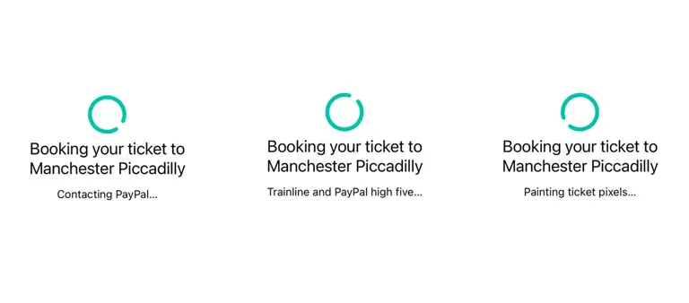
The Trainline app delights users through friendly brand-infused messaging
In order to deliver something that’s truly Loveable, I look to engage with stakeholders to decide what their top 3 key user groups are, and within that, if we could only cater to just 3 user needs what would they be? This sounds a little ruthless, but to me, it’s essential to deliver something that’s really useful and effective at the point of launch. We log insights from our research of the broader user groups and feed this into a long list of ‘nice-to-haves’ for launch, or a roadmap of future releases. It’s an approach that’s manageable and realistic for teams, whilst still enjoyable and useful for end-users.

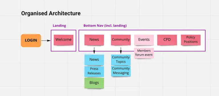
The number 1 pain point that clients come to us with is their navigation. It’s almost inevitable that over time a website can become bloated. Additional menu items are added, an abundance of uncared-for pages accumulate, and user journeys become blurred. This is for a myriad of reasons, from internal politics to staff turnover, to simply a lack of strong content management across the business. It’s also true that both brand and audience can change over time. This dynamic 5 years ago is almost certainly not the same as it is today. The Rule of 3’s allows us to look objectively at who the website is for and build an effective user-centric Information Architecture that meets the needs of both business and audience.
I’d love to know what you think of this approach? Ruthless prioritisation that delivers an effective, useful, and enjoyable user experience.
I find it to be an excellent starting point for projects that helps teams to launch with what matters most.
