Back
PERG

Transforming Perspectives: Rebranding the Private Equity Reporting Group  

The Private Equity Reporting Group (PERG) was established in 2008 to oversee compliance with the Walker Guidelines (reviewing the adequacy of disclosure and transparency in private equity) in the industry. Its role is to regularly assess how well large UK companies backed by private equity adhere to these guidelines. PERG provides recommendations to the British Private Equity and Venture Capital Association (BVCA) and publishes an annual report summarising its activities too.  

As such, the PERG public-facing website needed to effectively communicate its purpose in a clear, concise way that reflected its credibility. Recognising the need for an ethos change, PERG embarked on a journey to redefine their mission, better communicate with their audience, and enhance their brand identity.  

As existing partners of BVCA, having helped with their brand, website, and event microsites, PERG selected Cantarus as their agency of choice for the rebranding project.  

The Brief 

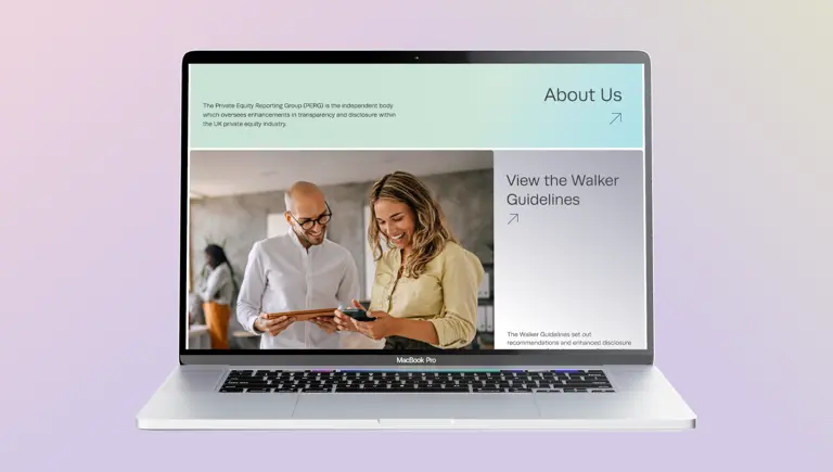
The existing PERG brand needed a refresh, moving away from a rather stuffy and corporate look and feel. Initial conversations with the PERG team involved buzzword searching, characteristic exercises, and mood boarding to inspire the creative direction of the project. The objective was clear – to create a clean, simple, and data-led brand, with a strong emphasis on people. Imagery that was people-focused was therefore an essential. 

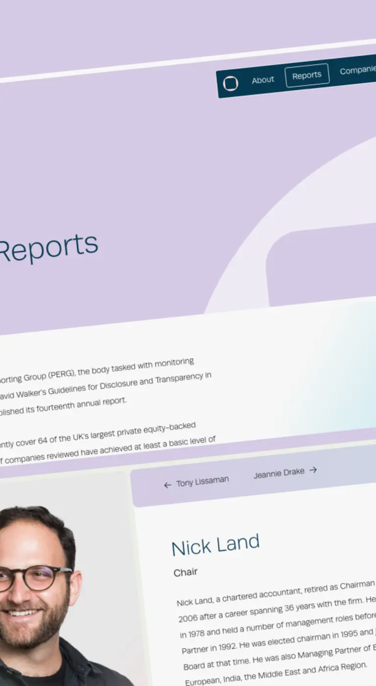
One of the critical aspects of the rebrand was to enhance the website’s user-centricity. We meticulously crafted a new site map and navigation structure to meet the needs of PERG’s audience and provide a seamless browsing experience. By putting the audience at the heart of the design process, we ensured that the new site is intuitive, engaging, and accessible to all.  

Another key piece of functionality was demonstrating the diverse portfolio of PERG companies via a member directory. Users can now effortlessly browse through the various company logos and click through to an external report or webpage to learn more. Additionally, the website brings key areas like PERG’s annual reports to the forefront, presenting this information in a visually appealing and digestible manner. 

Breathing Life into the Brand 
 

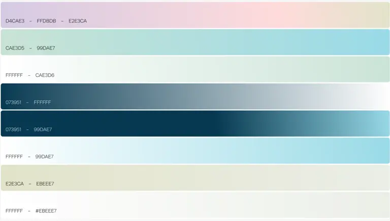
Collaborative efforts led to the selection of a captivating colour palette that struck a balance between pastel shades and deeper hues. While blue traditionally resonates with the sector, the decision was made to deviate from this typical ‘corporate’ blue, injecting a fresh and approachable feel into the branding. The use of earthy tones makes the branding much more approachable, evoking a sense of warmth and relatability, while keeping it professional.  

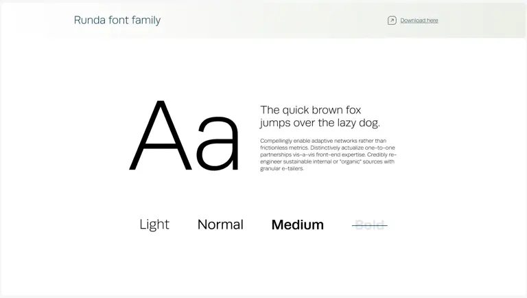
We selected a new typeface with a more refined feel. It’s simple, structured but ownable for the brand – the perfect balance between professional and friendly. 

We also expanded PERG’s brand toolkit; through things like gradients and blending accents together, we have crafted a visual experience that brings forward the essence of transparency, allowing PERG’s ethos to shine through every facet of its online presence. 

Unveiling a Dynamic New Logo
 

Another aspect of the rebrand was the creation of a logo that cleverly embraces the concept of transparency. Drawing inspiration from the idea of a window, the logo design took on a distinct shape and effect, evoking a sense of openness and clarity. The new logo conveys PERG’s commitment to transparency, trust, and providing a clear view into the world of private equity. 

The design is also super versatile, as it can be utilised to frame various elements and imagery, adding a dynamic and engaging visual dimension to PERG’s brand identity.  

In addition to the visual brand, we also developed the PERG website. Our designers and developers worked alongside each other to ensure the project was delivered within a fixed timeline.  

Overall, the new brand is fresh and modern and really reflects PERG’s status as a leading industry body, with a modern and professional aesthetic that conveys credibility and expertise. The rebrand was launched with a press conference and has received exceptional feedback from users so far, even garnering a mention in The Times.

We’re immensely grateful to Cantarus for their invaluable support in PERG’s rebranding journey. Their expertise and innovative approach have been instrumental in bringing our vision to life; from the captivating logo design to the carefully curated colour palette, Cantarus has created a brand identity that is both inviting and relatable to our audience. We would highly recommend Cantarus’ services to anyone looking for a new brand!

Greg Whittaker Senior Marketing Manager

Headshot of Cantarus' Head of Experience Design, Rob

Want to know more?

Our Head of Experience Design, Rob Helsby, would love to chat with you about your design and brand needs.

Get In Touch