


Did you know that our online world is 50% more likely to present barriers to disabled people compared to non-disabled people? The most common barriers include unclear online content (13%) and online information being challenging to see (8%).
So, with this in mind, why is there still the common misconception that accessible design and good design can’t go together?
You don’t have to choose between a beautiful or functional website, you can do both.
Read on to see 5 examples of web designs (both good and bad) and their impact on accessibility.
Back in 2019, pizza giant Dominos was sued for not having an accessible website or app, meaning that one blind man was unable to order food, despite him using screen-reading software. Not only did the chain have to deal with the huge legal costs, but they also had to deal with the blow to their reputation.
Ensuring your website follows rules and regulations is an absolute must if you want to stay competitive, and with the legal ramifications involved, accessibility really should be high on everyone’s agenda.

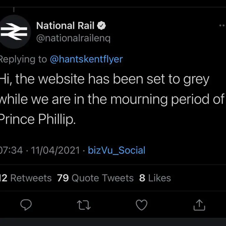
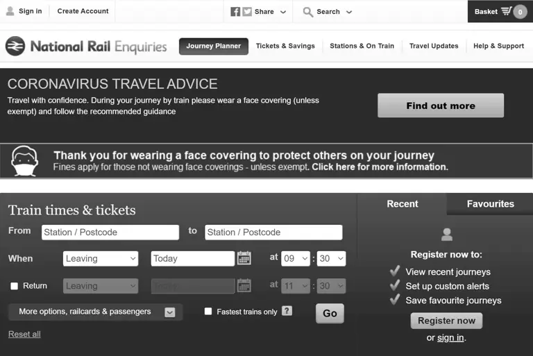
There was chaos amongst National Rail customers when the organisation changed its signature blue and yellow colour scheme to grayscale as a mark of respect for the passing of Prince Philip, the Duke of Edinburgh.
This alteration made the website unnecessarily difficult to use or read, particularly for those with visual impairments or colour blindness.
It wasn’t long before the complaints started, and National Rail reverted to their normal colour scheme within a day.
Digital accessibility should never be an afterthought – nobody should be excluded from accessing vital services and information. Consider how such seemingly small choices can affect some of your users and ensure you don’t make the same mistake.
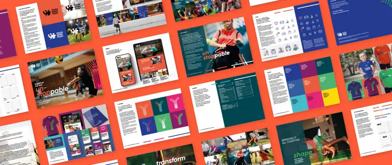
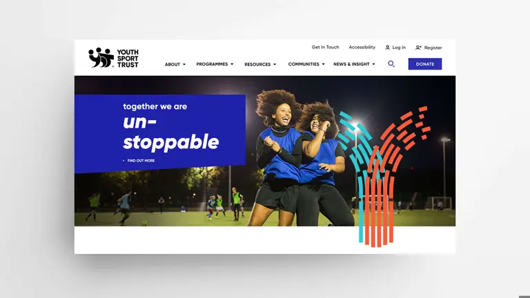
We delivered a large-scale website for national children’s charity, Youth Sport Trust, that complies with AA accessibility standards. Accessibility was a key priority from the start of the project; as an organisation working with inclusion schools, the charity needed to deliver highly accessible digital solutions.
From large, high-res imagery that’s easy on the eye for those with sight impairments, to distinct colours and large fonts – the result is a visually stunning and easy-to-use website. The website proves that there’s no need to strip back and offer a poor digital experience, you can still create a beautiful result while meeting accessibility guidelines!
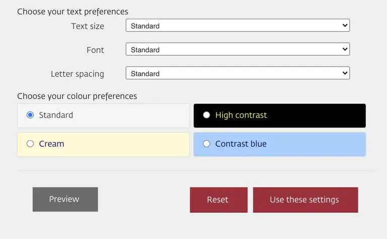
The Manchester City Council website has excellent accessibility settings, accommodating all their online visitors by allowing them to choose the colours and text sizing of their preferences. This makes it much more readable and well put together.
Guidelines give us rules to adhere to, but they don’t take away the ability to deliver amazing, highly creative solutions like this.
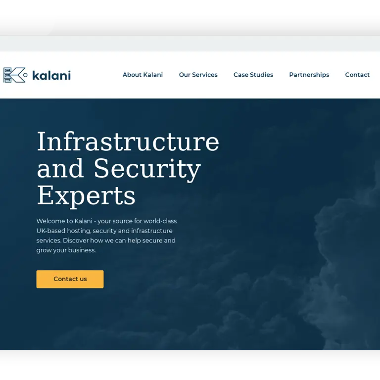
We fully audited the Kalani website with a mix of automation tools and human consideration, bringing the website up to AAA standard – absolutely no errors are shown when checked!
We created user interface elements and adjusted the use of colour in certain areas, with the website code rewritten and checked thoroughly to ensure all needs were met.
These examples remind us that it is possible to have a fully functional, inclusive website that is still attractive. When we design empathetically, we’re designing to benefit everyone.
If you’re unsure of your own web design or whether it meets accessibility requirements, an accessibility audit is a great place to start.
