

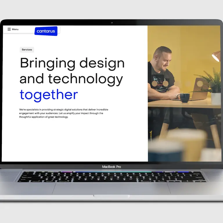
Unfortunately, a rebrand project is often misunderstood as an expensive, superficial, self-indulgent exercise. Design Twitter can be a reactive cauldron of vitriol which can knock a creative’s confidence and even have key stakeholders lose faith in the brand. Without seeing the bigger picture, there’s often an unfair focus on the cherry on top of the project — the new logo. I want to tell the story of our brand evolution, our process, and why we’re proud of where this journey has taken us.
When I joined Cantarus in 2019, I felt we had a world-class offering but had trouble communicating that effectively to the world. In short, we had an image problem. I know what you’re thinking — a new creative lead joins the agency and wants to rip it up, start again, and make their own mark. Classic! There’s maybe a *pinch* of truth in that, but I knew I wasn’t alone in thinking we had to move the needle on our brand and digital presence. I trusted my gut and would later learn that many others had felt the same.
Everyone’s favourite global pandemic meant that my focus pivoted to adapting how we worked with our clients and each other, whilst ensuring we continued to deliver outstanding levels of service and support. It wasn’t until the Summer of 2021 that we started really looking at ourselves in the mirror and began planning an ambitious future of growth and success.
In previous roles I’ve often found myself at the heart of an internal rebrand or repositioning job of some sort. As a creative with a passion for digital brand communications, it comes with the territory. I know first-hand that they can be some of the most challenging and frustrating projects imaginable. For all the industry-standard grumbles about client feedback bingo, agency folks actually tend to share the same traits when it comes to sharing opinions and shifting expectations. We are all human, it seems. For this project to succeed we had to practice what we preach and follow our battle-proven methodologies from Day 1.
Our journey began with research and engaging with the Leadership team, those with the deepest knowledge of the organisation, its strengths, weaknesses, history, and direction of travel. Our UX Consultant Claudia led us through an in-person(!) 3-hour workshop to discuss our company’s future, purpose, perceived values, audiences, brand personality and competitors.
We gave everyone a voice in the process through a staff-wide survey. Understanding what the team thought of our business was a vital engagement piece which taught us a great deal. From the beginning, we wanted to ensure that our people were a key part of this journey. We asked questions like:
How would you describe Cantarus to a friend or family member?
In your role, what do you pride yourself on?
What values do you think we represent as an agency?
We wanted to understand how closely the views of the leadership team aligned with the wider agency. Is our core offering clear to the people who work for us, let alone clients and the outside world? What do our teammates love about working here? What’s their actual relationship with the Cantarus brand…what really matters to them?
In addition to asking about their perception of our current logo and website, we needed to learn how our people related to us as an organisation. What really cuts through the layers of polish and marketing communications?
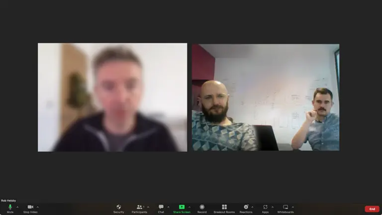
Surveys are a great way of gaining quantitative data but we wanted to support this with more qualitative research in the form of Zoom interviews. We selected a cross-section of the business to have a 30-minute follow-up call, speaking with people who have been with the agency for 6 weeks and for 6 years, people from a technical background…office managers and everyone in between. This exercise helped reinforce some of our initial findings and unearthed some additional golden insights too.
We rounded off our research by listening to what our clients thought, reviewing their Drum Recommends feedback and scores and speaking with some partners directly. Through this, we learned more about our strengths and what matters to the organisations we work with.
The research phase helped us to outline a vision for the agency’s future over the coming years, with Leadership teams reassuringly aligned on their ideas for growth and development. This big-picture thinking underlined our collective ambition for continuous improvement and constantly challenging ourselves to strive for more.
Before I could unleash my team of passionate creatives on the visual rebrand, we needed to solidify our organisation’s mission statement and define our 3 core values.
Innovation: We think creatively and apply the right technologies to deliver brilliant products and services for our clients and their end users.
Passion: We’re always excited to work hard, learn and grow. We collaborate in delivering the best work of our careers.
Integrity: We communicate honestly and openly, take professional pride in what we do, and foster a supportive environment for our clients and team.
These values had to be relatable to every person across the business, from strategists to developers, graduates to team leaders, and they absolutely had to be honest and authentic. The values grew from our surveys and interviews so they are truly representative of the people who will uphold them.
After much deliberation and iteration — we landed on a simple and clear mission statement.
This message needed to resonate with our key audiences — employees, applicants, clients and prospects. It had to be clear, unambiguous, and inspiring.
I once coined the phrase Reframing Digital. It means applying technologies in bold and creative ways to create the unexpected, taking our clients’ products to places they haven’t been before, and shaping joyful user journeys across multiple touch points. Our mission statement embodies this ethos.
Guys, we did it! We held off exploring any design ideas whatsoever until we had solid research and a clear strategy in place. Creative abstinence at its finest.
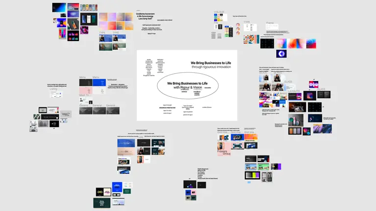
It was so exciting to begin sourcing reference imagery and compiling inspiration boards of colour, type, imagery, motion and interaction.
In collaboration with our Senior Designer Aaron, we tumbled down many rabbit holes and slowly collated our visual research into more clearly defined creative routes.
Whenever we’re working on a branding project like this I am always mindful of obsession. We can quickly become fixated on an idea that absolutely is THE Idea. You push and push and can’t see beyond it, which sometimes sends you around in circles and neglects to consider other points of view. I wanted us to effectively take this raw emotion out of our process and force us to step away from the project every few weeks. We would work intensively, pitch our progress to the company directors, and then take a big step back. If we felt the same passion and advocacy for the work when we picked things up again it would be a good sign that we’re moving in the right direction.
Playing with motion, being bold and expressive with typography, mocking up physical and digital brand executions, supporting and challenging each other every step of the way. We went through multiple presentation loops until the lightbulb moment came to us and everything started to come together.

Our new brand identity is an evolution of what came before and a launch pad to where we’re moving towards. I’m a firm believer that a great visual brand simply has to work for everyone. Whether you are a highly skilled animator putting together a showreel, a content marketer setting up a social campaign, or a time-poor team leader looking to put a last minute proposal together…we need to see a couple of things shining through. It has to look great. It has to feel consistent and on-brand. It has to be easy to use. For these reasons, we have crafted a simple and effective identity built for the screen.

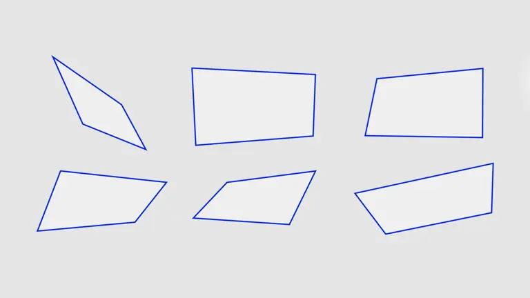
The logo draws on the concept of Reframing Digital, wrapping our unique variation of the Universal Sans typeface in an abstract mobile phone shape. Our visual identity comes from the screens of our digital devices, often rotated three-dimensionally to add depth, interest and variety.
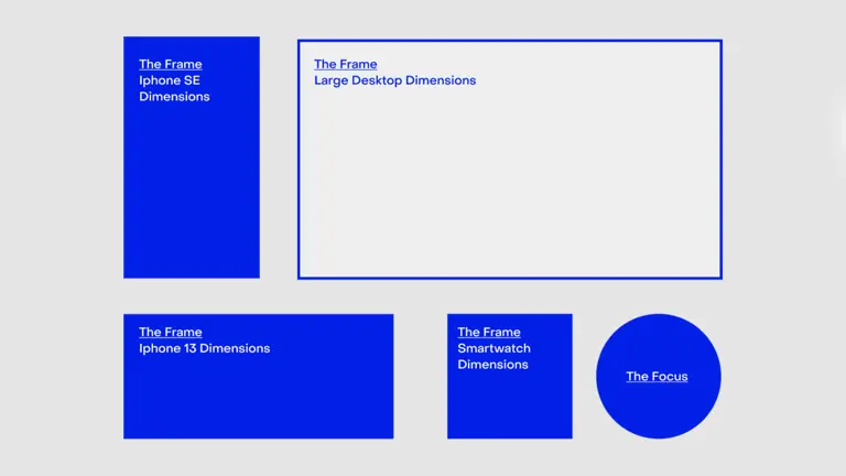
We built a design language centred around the ‘Frame & Focus’, taking the multitude of rectangles and squares from all of the phone, tablet, smartwatch and computer screen sizes in the world. These were paired with a circle or dot, which represents the user interacting with a device through their mouse cursor or fingertip. Here we are putting digital experiences at the very heart of our identity.
We are an agency that really cares about accessibility and it’s our collective responsibility to ensure the work we do can be enjoyed by all. We curated a colour palette that meets the WCAG guidelines and gives us a lot of flexibility to pair different coloured typography and backgrounds. Our design and development teams baked the #a11y guidelines into our new website, and we’re delighted to launch a platform that is both highly usable and an excellent demonstration of our team’s expertise.
Along the way we’ve collaborated with some super talented experts, like Duncan Elliott who helped us out with a set of fresh lifestyle and portrait photography, and Leeds-based Lightabox who turned our new logo into some awesome illuminated signage.
This has been a lengthy and, at times, difficult process of patience, compromise, and bloody hard graft. It has taken almost two years from discovery to go-live and I’m so proud of what we have achieved together. Today we start a new chapter in our agency’s history, and I personally can’t wait to see where we’ll go from here.
