Back
IAL

A Compelling new visual identity for the IAL

The Institute of Association Leadership (IAL) is the professional community for current and future chief executives and C-suite professionals who lead organisations in the membership sector. The IAL is in the process of advancing its mission; focused on the elevation of association leaders.

The IAL created its 2021-24 Strategic Plan with the objectives of developing association leaders and expanding organisational outreach. With this strategic plan in place, it was vital that their brand and website gave them the confidence and the look and feel that would really push them to the next level and amplify their strengths.

IAL banner logo

Cantarus partnered with the IAL to help bring their goals to fruition. They needed a refreshed brand identity that would build brand awareness and deliver impact, as well as ensure all their visual communications were coherent.

We started working with the IAL in late 2020, conducting a full review and audit of their existing website and brand. The site was built on strong foundations, but there was room for improvements to be made across the board.

We kicked off the project by creating a series of concepts and high-level mood boards that focused on 3 themes, inspired by the organisation’s Strategic Plan:

  • Connecting People,
  • Expanding Globally,
  • Leading by Example.

The mood boards each had a distinct look and feel, which was a great way to test out different ideas and find what would be most appropriate for the IAL. We later refined the boards into a single brand vision which was used to inspire the design direction for the project.

Building the Brand

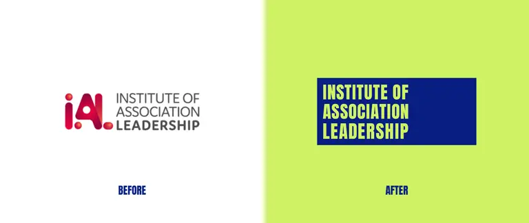
The old IAL logo was our first port of call for the revamp – it wasn’t accessible, the capitalised wordmark gave the wrong tone, and its colour scheme wasn’t ideal for working in mono colour black or white as it wasn’t legible. We produced a brand-new logo based around a monolithic shape that is now proudly displayed across the site clearly and consistently and is instantly recognisable.

The Monolith device represents leadership – from towering city office blocks to a strong beacon symbol, the iconic rectangular device flows throughout IAL’s new brand language. Extending beyond the logo, this allows IAL to frame images, insert block colours for key messaging, and pull their audience’s attention towards any important information.
IAL logo before and after the rebrand
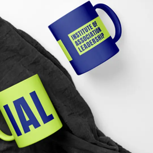
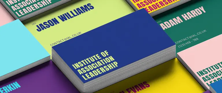
Stacks of IAL business cards
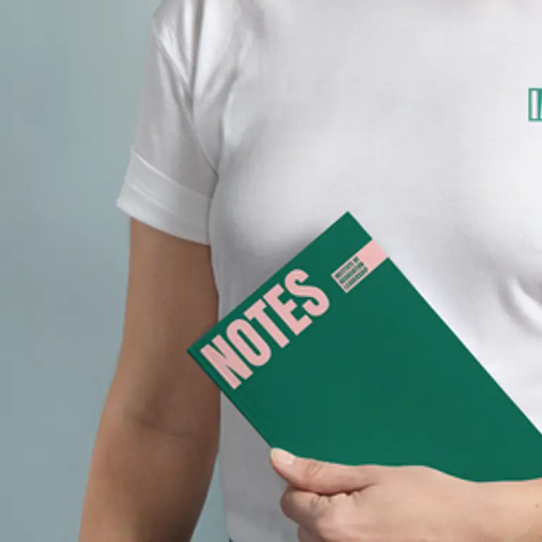
IAL notepad and tshirt
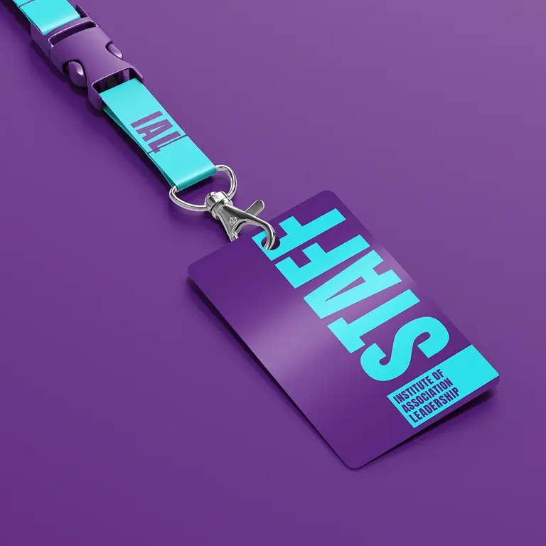
IAL staff lanyard in purple
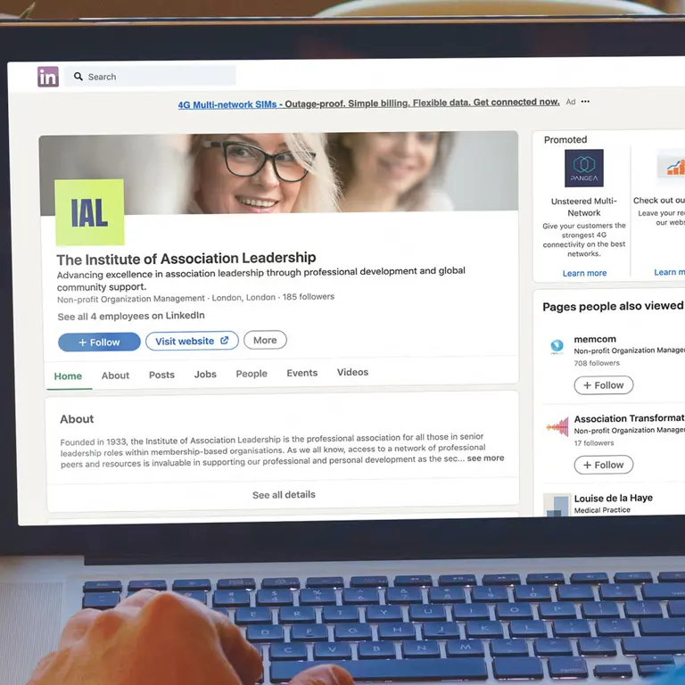
IAl band in place on social media

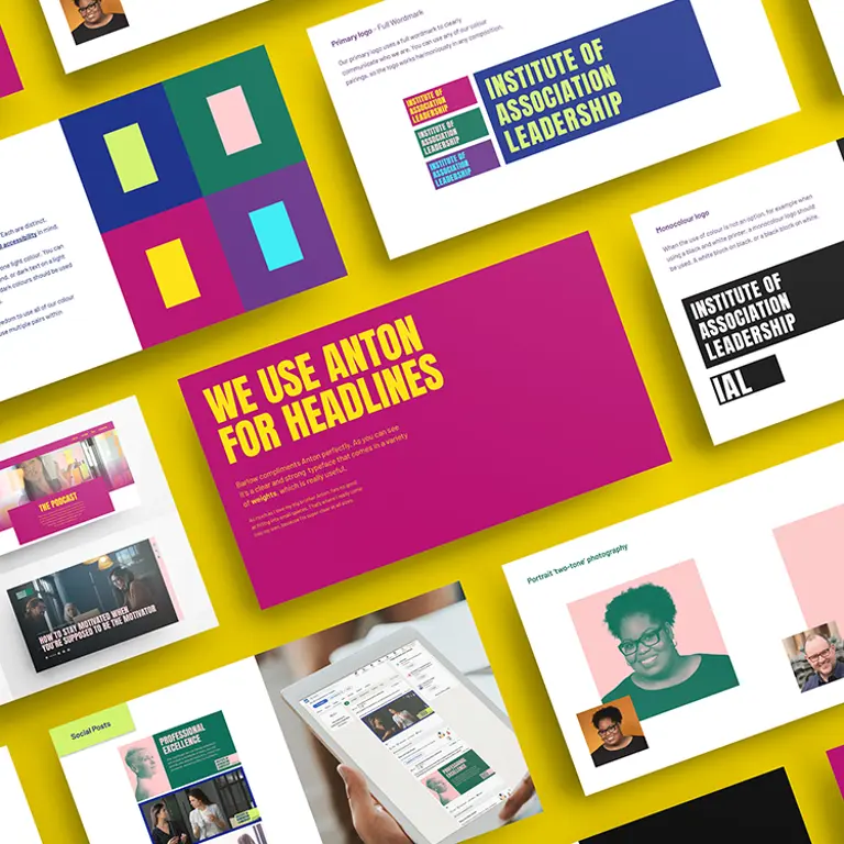
Previously, the IAL used two very similar fonts across the site which didn’t have an obvious difference between them. We recommended two complimentary typefaces to help the organisation better tell their story. Anton was introduced for large and confident headline copy, with the ever-flexible Barlow used for all other messaging due to its clarity and breadth of weights.

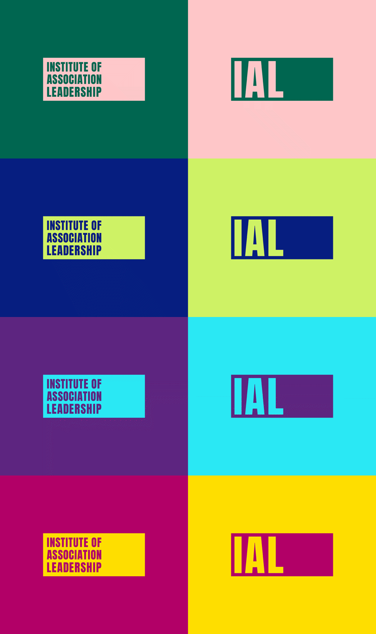
The old IAL colour palette may have been seen as aggressive and not particularly welcoming; black and red can often be viewed as quite alarming colours. As such, we chose a refreshed colour palette ranging from bright blues and pinks to tech-savvy greens, with 4 distinct colour pairings that are strong and eye-catching, and bring a bit more warmth and personality to the brand. Not only this, but they were all chosen with digital accessibility front of mind.

Straight from the get-go we knew that Cantarus was the ideal agency to work with on our rebrand project. The team are a pleasure to work with – efficient, creative, and professional. The new IAL brand is more than we could have hoped for and will really resonate with our members. Cantarus listened to what we wanted and have completely exceeded our expectations.

Laura Gibson Project Manager

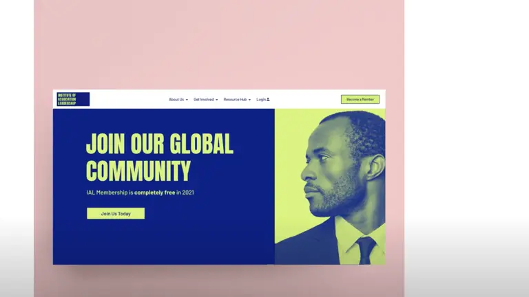
Imagery is a huge aspect of brand storytelling and shouldn’t be overlooked. It’s important that image style is consistent and clearly defined. There was a wide mix of photography across the old site that wasn’t particularly coherent, so we suggested a carefully curated bank of stock imagery that would bring greater consistency and more memorability to IAL’s brand communications. In addition, we created a two-tone colour effect that can be applied to headshots of the IAL’s global leadership team and its members. All the available photographs were shot in different styles, so this image treatment helped to unify them.

IAL colour combinations demonstrated in a gif

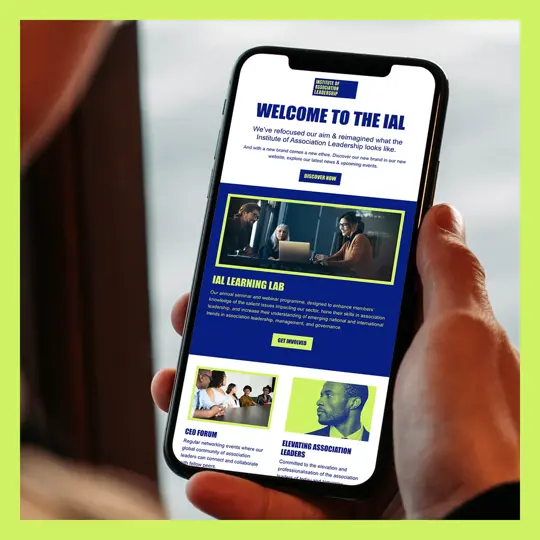
IAL’s new brand identity is simple but confident and highly effective. We produced detailed brand guidelines and marketing templates including social media banners, email signatures, and email newsletter templates, to enable IAL’s team to be more self-sufficient and support the new brand themselves going forwards.

We then moved onto the web phase of the project. The new site is built on Umbraco using customised themes and designs, and IAL has benefitted from our expertise on all things Umbraco.

The new site and brand launch went live with a bang in August 2021 and has since received fantastic feedback from IAL and their users alike.

Person working at desktop
Headshot of Cantarus' Head of Experience Design, Rob

Want to know more?

Our Head of Experience Design, Rob Helsby, would love to chat with you about your design and brand needs.

Get In Touch