Back
PRB Academy Partners since 2022

Standing Up for Sustainability

The Chartered Banker Institute (Institute) is a global professional education body and not-for-profit educational charity for bankers. The Institute was planning to initiate a digital project to expand its reach and enhance its offering to its 33,000+ members.

They approached Cantarus with a considerable challenge to design and build a dedicated learning microsite, The Principles for Responsible Banking Academy (PRB Academy), to be enjoyed by banking professionals worldwide.

The Brief

The Institute recognised the unique, critical role that banks play in pivoting the global economic system to redirect capital and accelerate positive change across economies. Every single banking professional should consider responsible and sustainable practices in their day-to-day decision-making.

In collaboration with UNEP FI, the Institute, and one of the largest organisations for international development cooperation worldwide, PRB Academy is a brand-new venture that will support banks to align their professional practices with the UN Principles for Responsible Banking framework.

PRB Academy is a unique online learning programme for the banking industry, dedicated to shaping the future of banking and raising the standards of banking education and training worldwide.

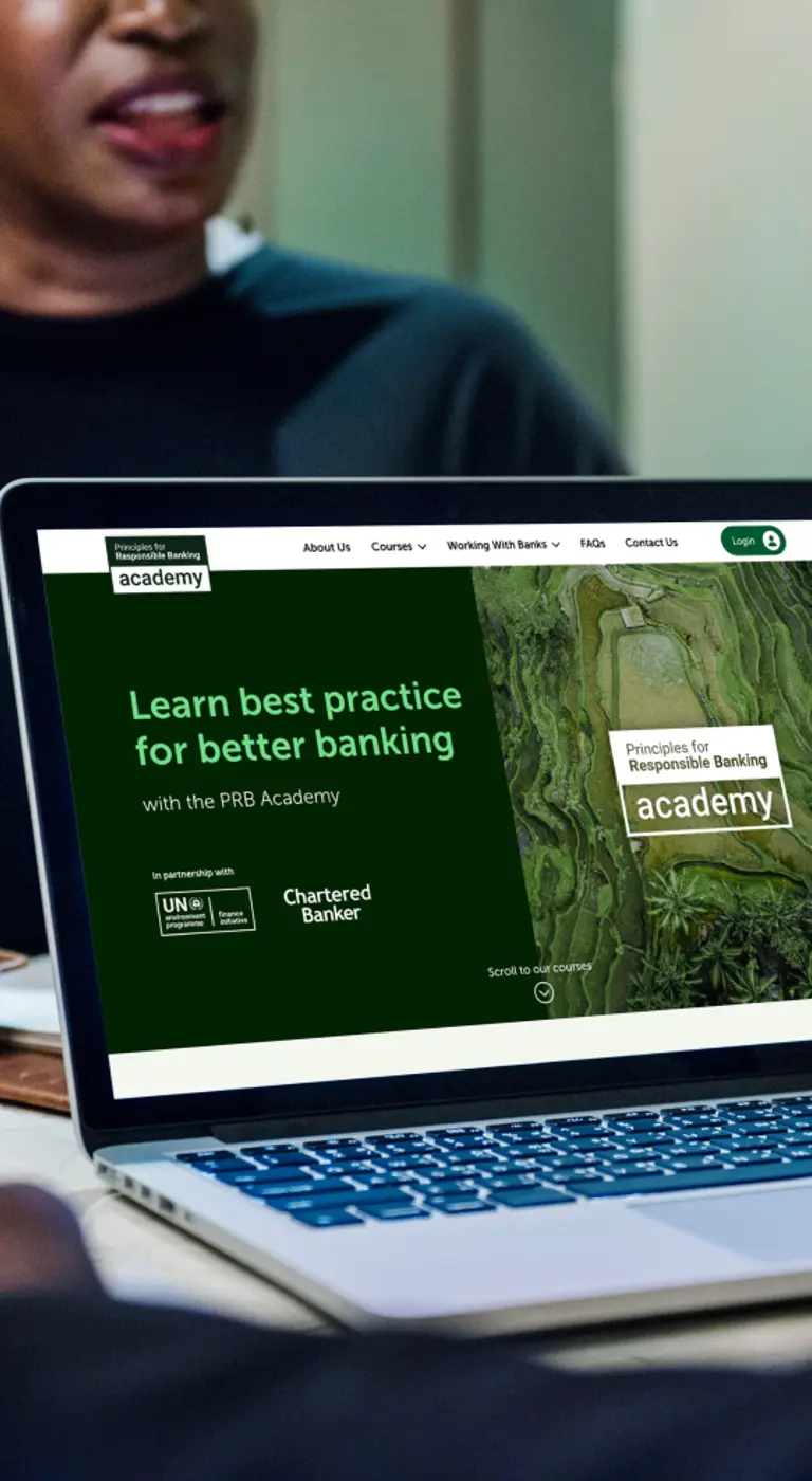
PRB homepage on a laptop screen
Eco-conscious Branding. Enormous Impact.

Our designers crafted a brand identity for the organisation centred around the idea of sustainable banking. We wanted to tell a story with engaging and visually attractive branding.

We created a myriad of mood boards to demonstrate various creative directions for the brand – sustainability is typically associated with calm, soft, natural colours that feel approachable, yet this felt a little at odds with the corporate banking world. Banking would usually associate more with darker colours and a more serious aesthetic.
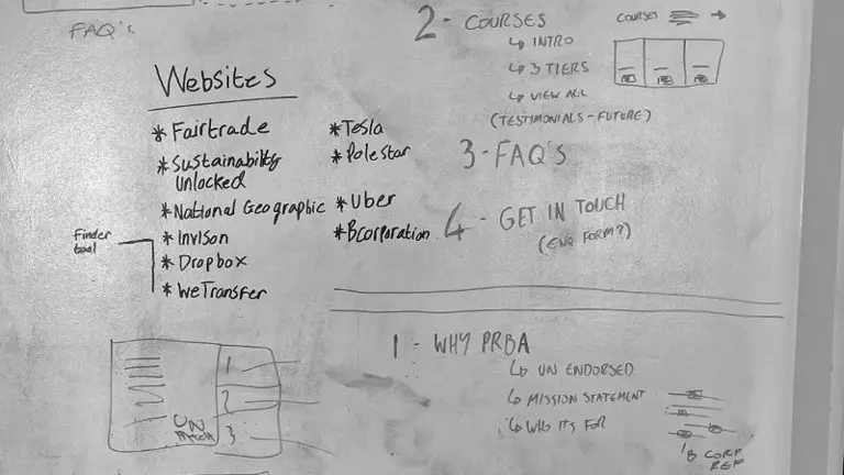
A list of websites inspiring the PRB project
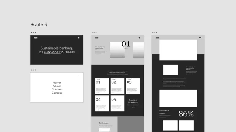
One possible design route presented by Cantarus

Ultimately, we decided on a brand that would appeal to the business world – demonstrating sustainability but with an underpinning assertiveness.

We utilised a palette of black hues and natural, earthy colours like deep green leaves and blue ocean waves to highlight sustainability and nature. Imagery needed to be consistent and align with what ‘business’ means across a variety of cultures, so we explored a diverse range of people photography and paired this with awe-inspiring shots of the natural world.

Topography lines were introduced as a graphic device, further connecting the brand to the environment.

In addition to a visual brand, guidelines, and key messaging, we also created the microsite for PRB Academy. Our brand and web designers worked alongside each other to ensure both projects were delivered within a fixed timeline.

A man on the phone with his bank making notes on paper
An example of a tube advert for PRB
A woman at a desk overlaid on natural texture
A grid layout showing all possible icons for PRB

The leading-edge learning platform is accessible globally, with all training available online for individuals at all stages of learning to support banks transition toward a better, brighter future.

Working with the Academy project team and stakeholders, we undertook a series of online workshops to identify key website goals, objectives, KPIs, and UX priorities. We did a deep dive into who the website was aimed at before carefully considering the site’s information architecture.

It was essential that content was accessible to a global audience who might not speak English as their first language, so we ensured to utilise straightforward wording, avoiding any jargon or financial terminology to make for easy translation.

Navigating the world of sustainable banking can be tricky, so we ensured slick, professional navigation with simple signposting. Users can choose from the four learning courses, with interactive eLearning resources and guided self-study.

three mobile panels from the site
The Results


The PRB Academy brand truly represents just how the business decisions we make today have an impact on the earth and its future.

It’s early days, but feedback has been fantastic from Academy users and the team alike. We’re excited to see the Academy grow and thrive in future!

Cantarus have designed a truly unique brand and microsite that will accelerate the transformation of the banking sector towards more sustainable practices – and we’re really pleased with the results. They interpreted what the Academy stands for, and what we want the Academy to achieve, and not only does it look amazing, but it ticks all the boxes from a user experience point of view too. Thanks to all the team at Cantarus!

Anna Young Head of Marketing & Events

Headshot of Cantarus' Head of Experience Design, Rob

Want to know more?

Our Head of Experience Design, Rob Helsby, would love to chat with you about your design and brand needs.

Get In Touch